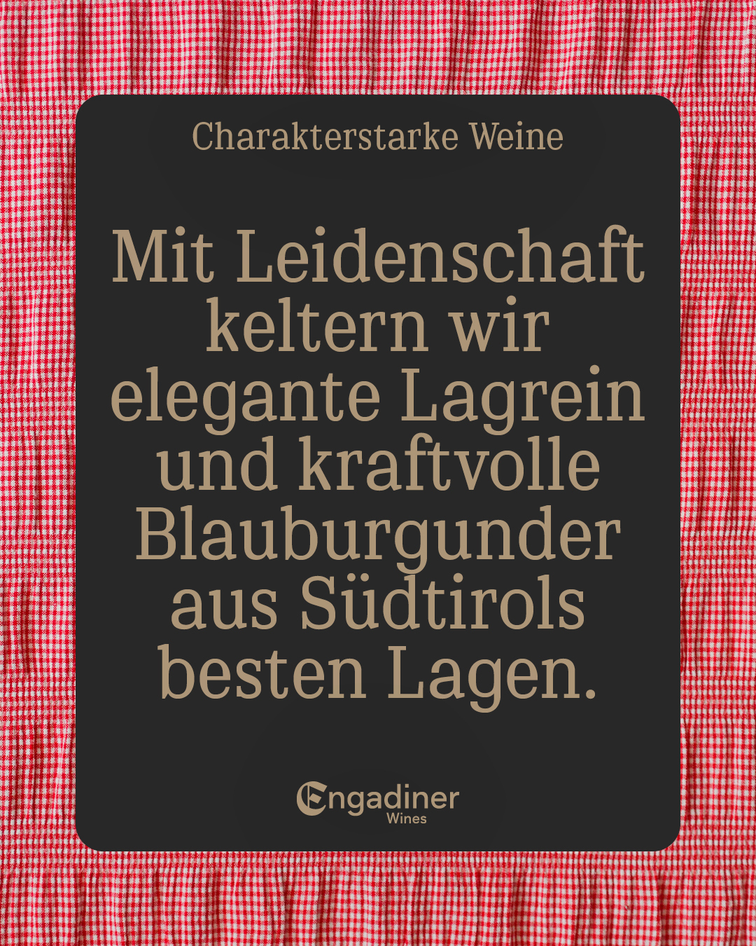
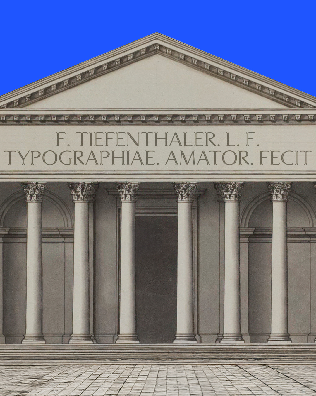
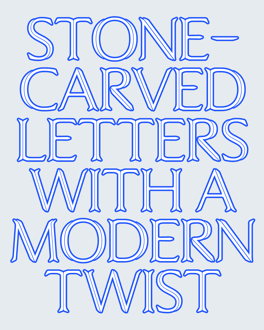
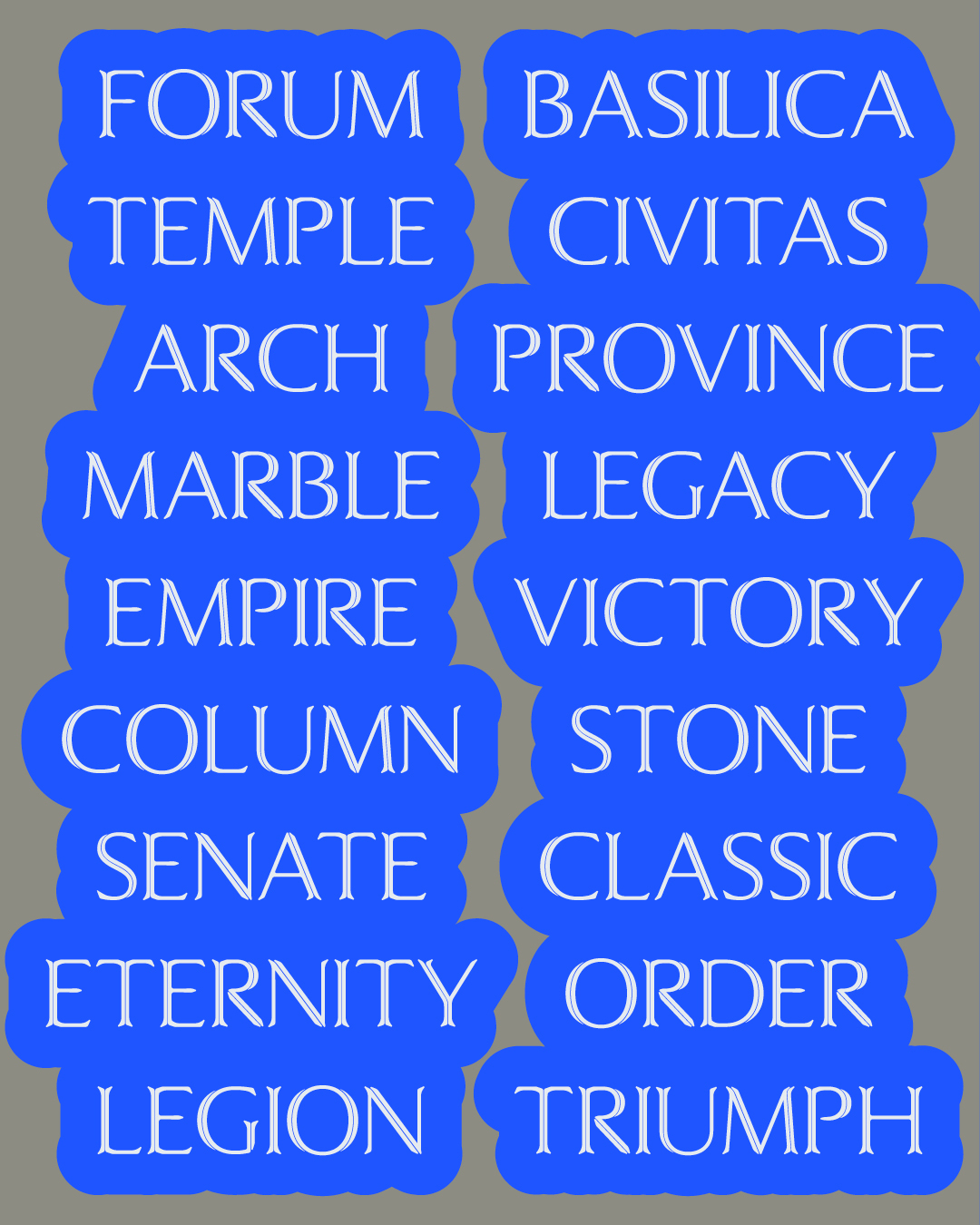
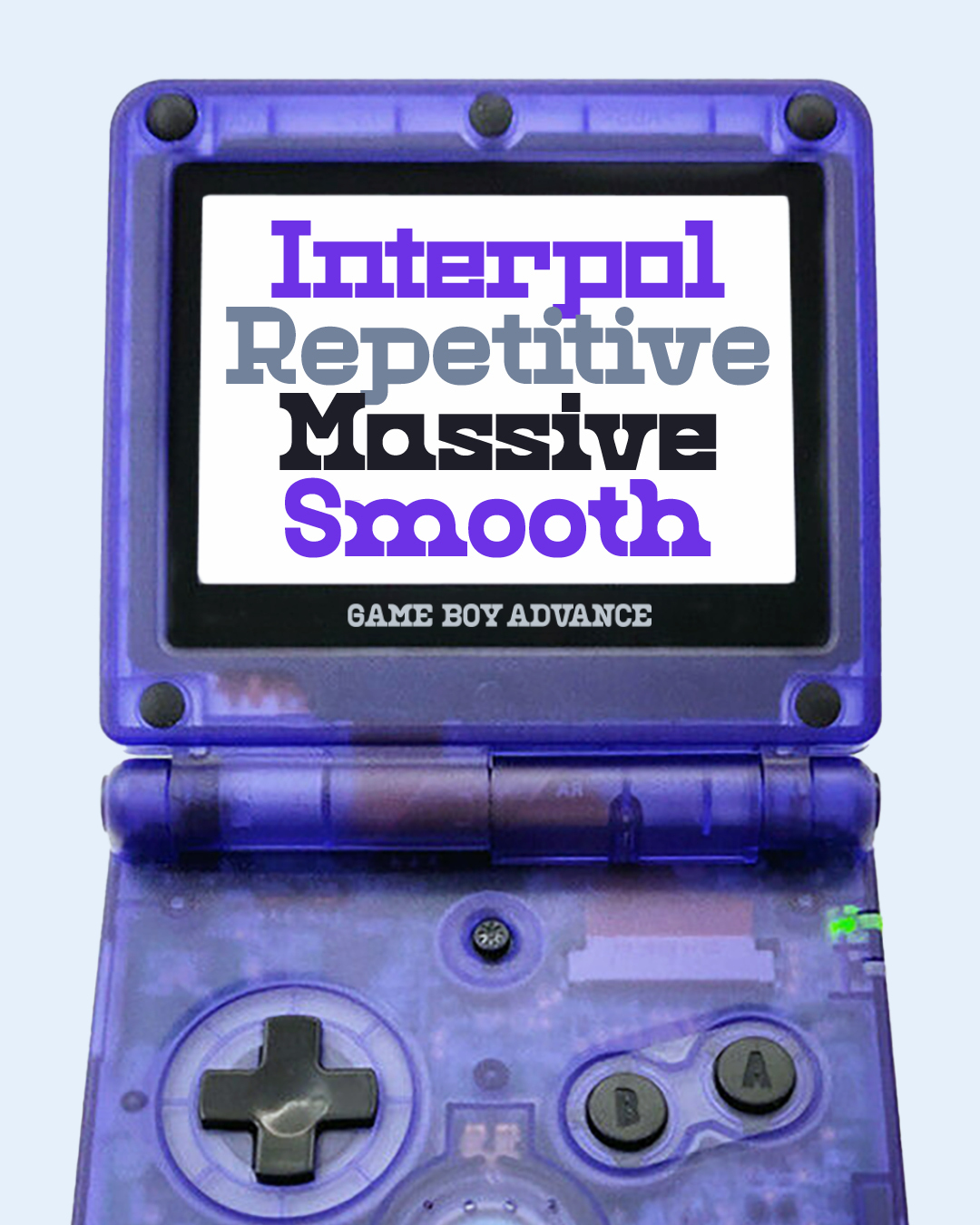
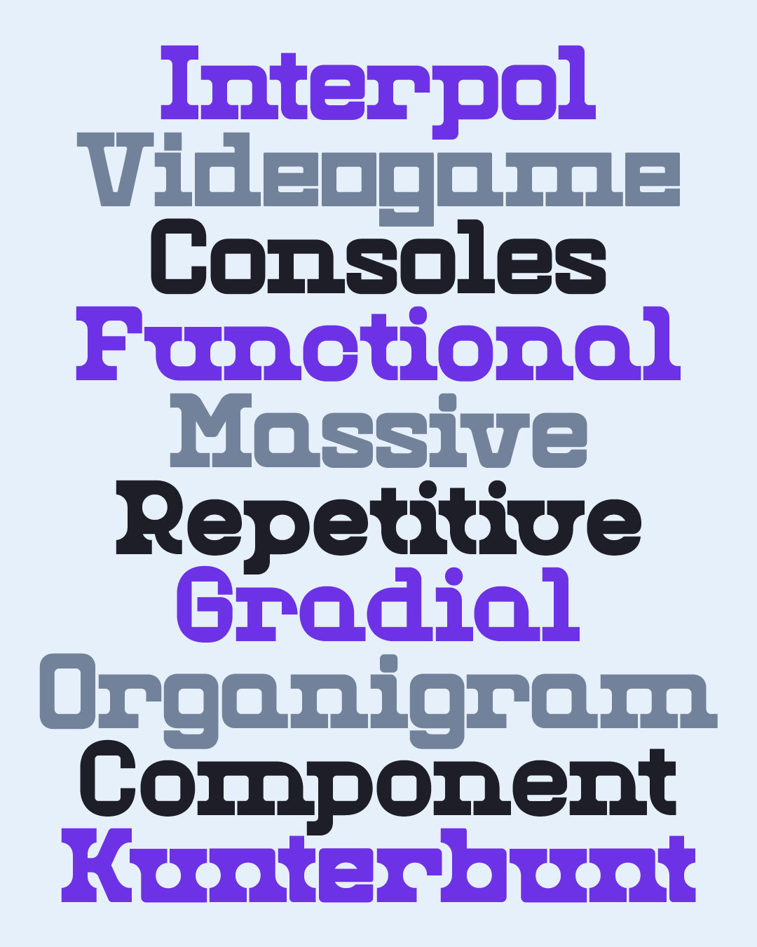
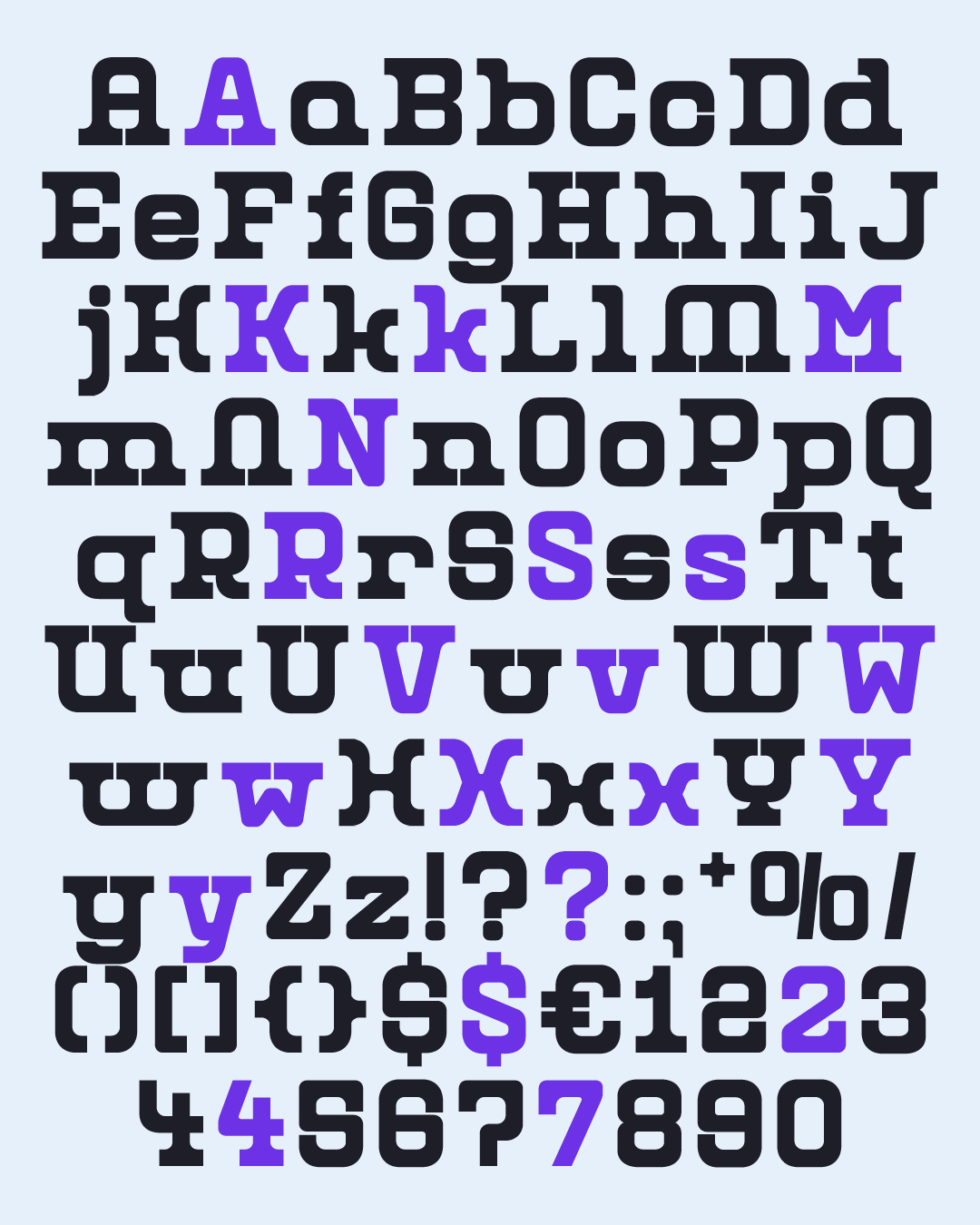
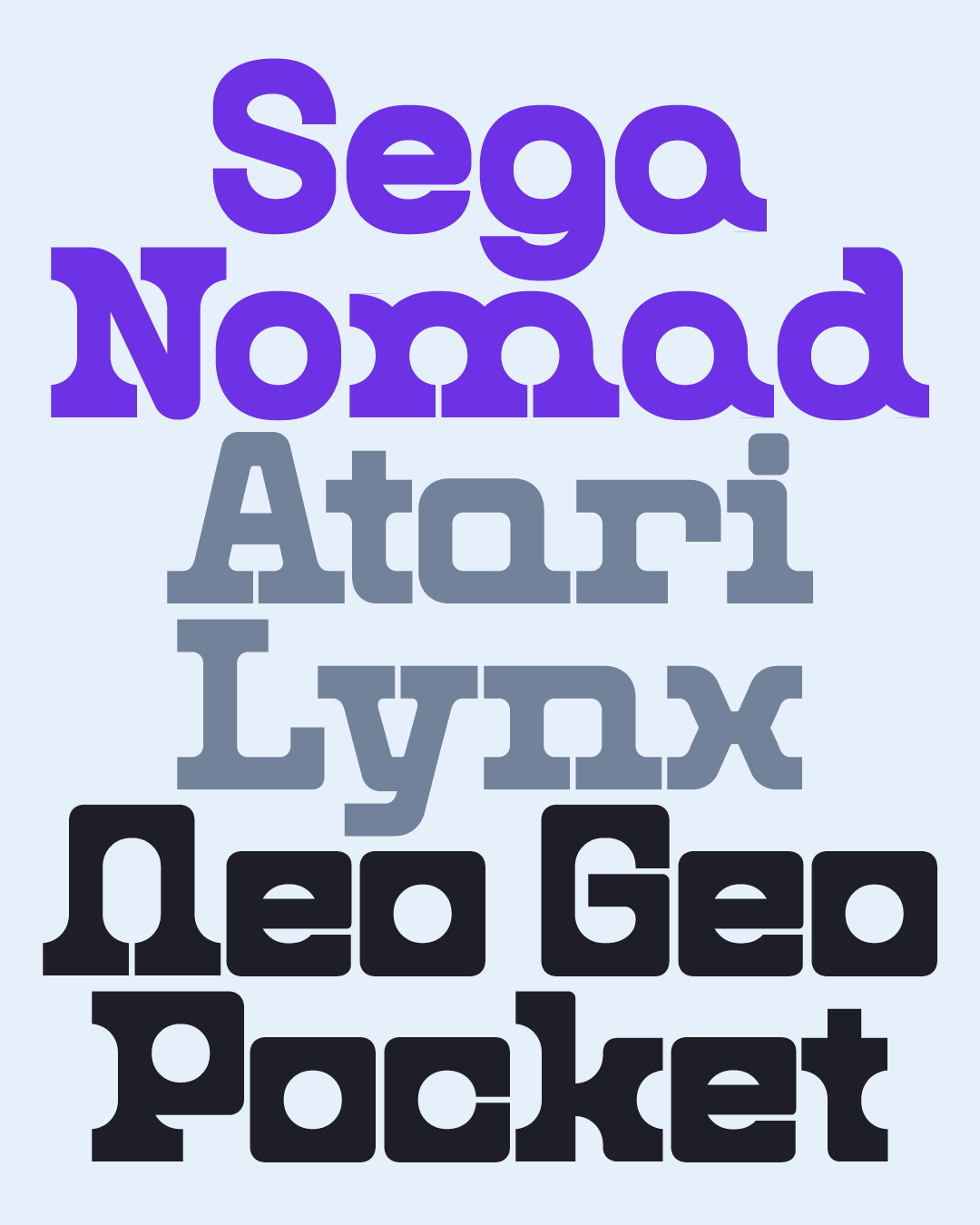
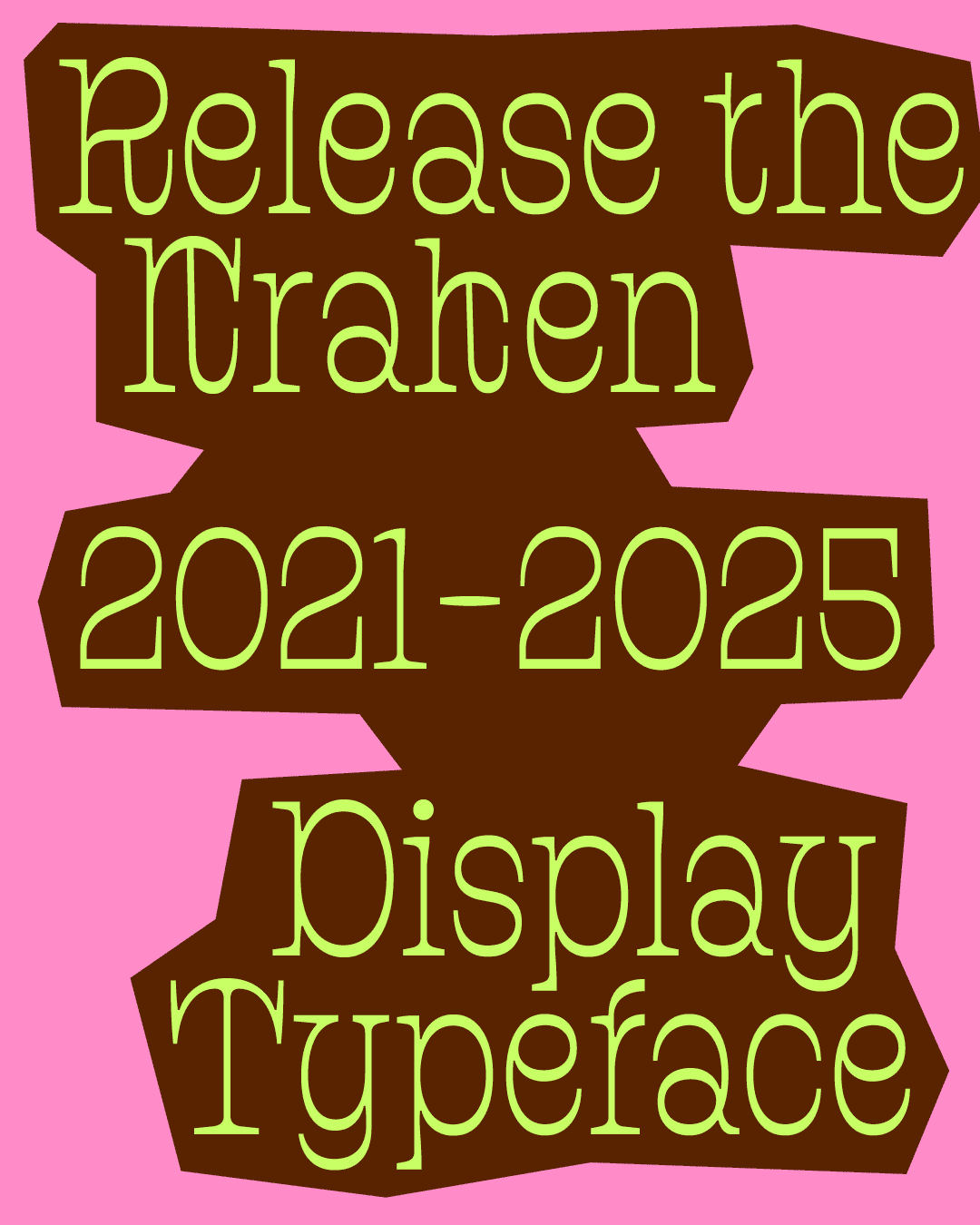
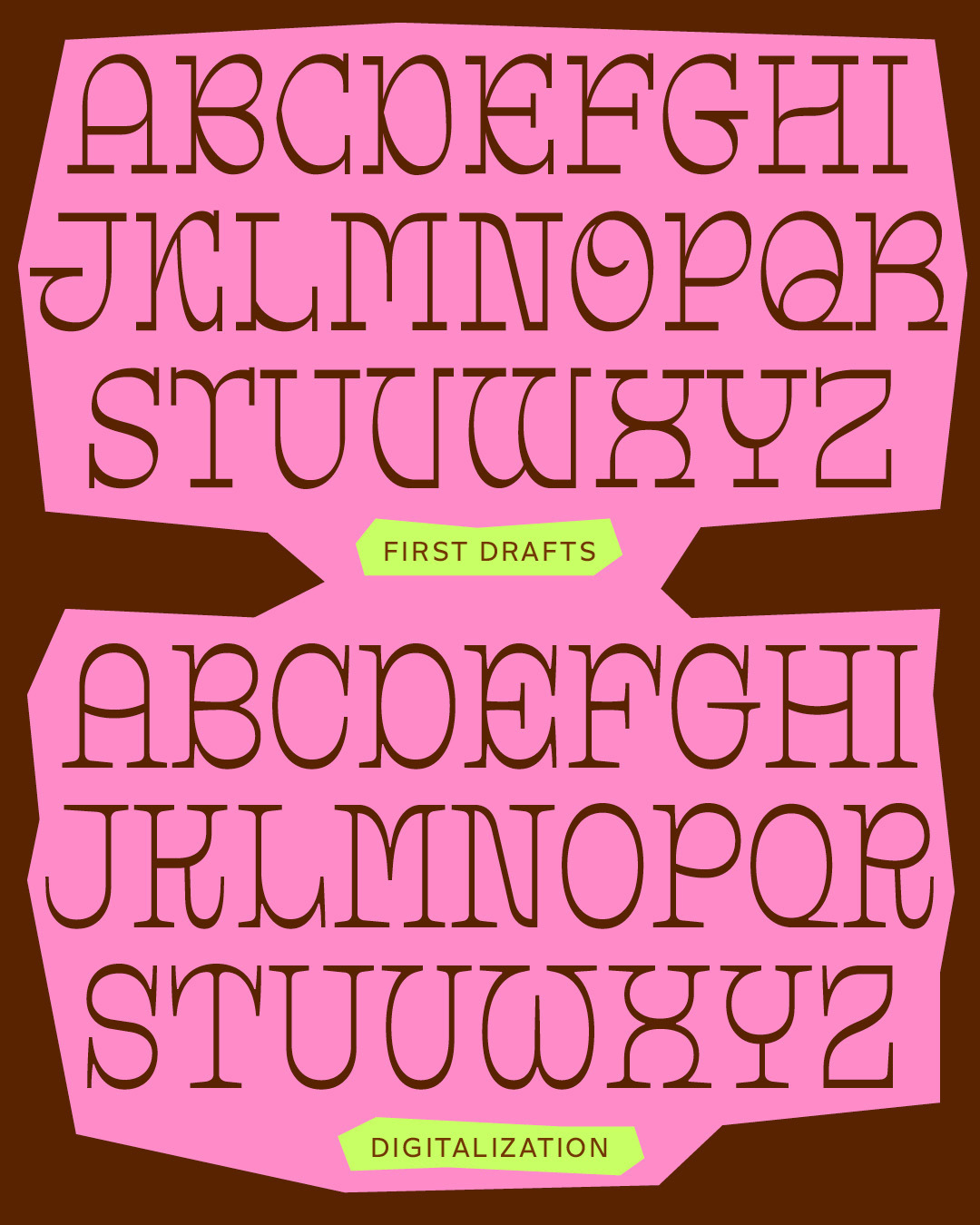
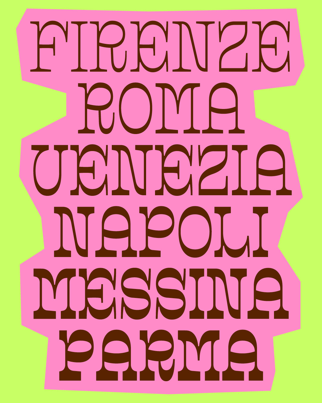
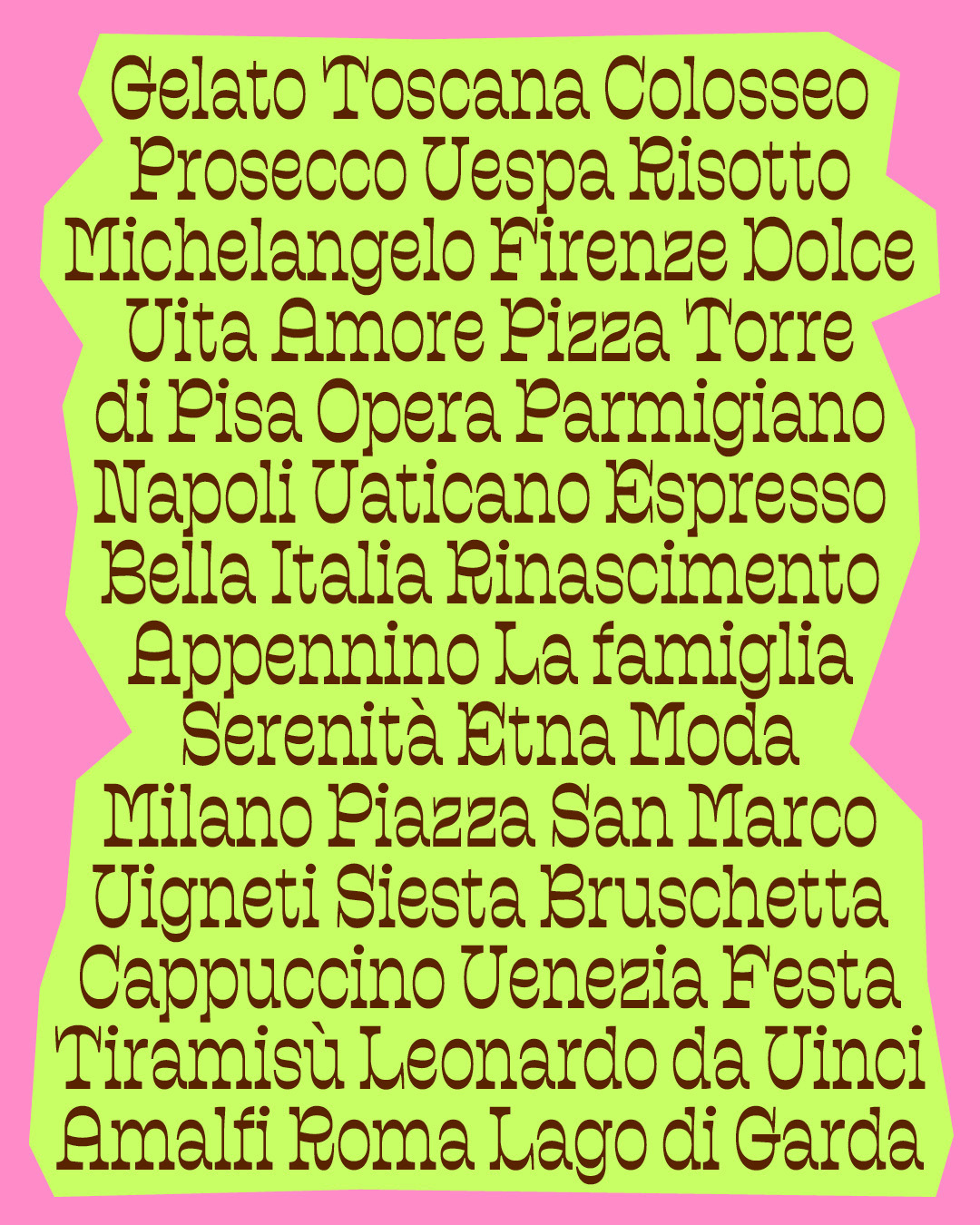
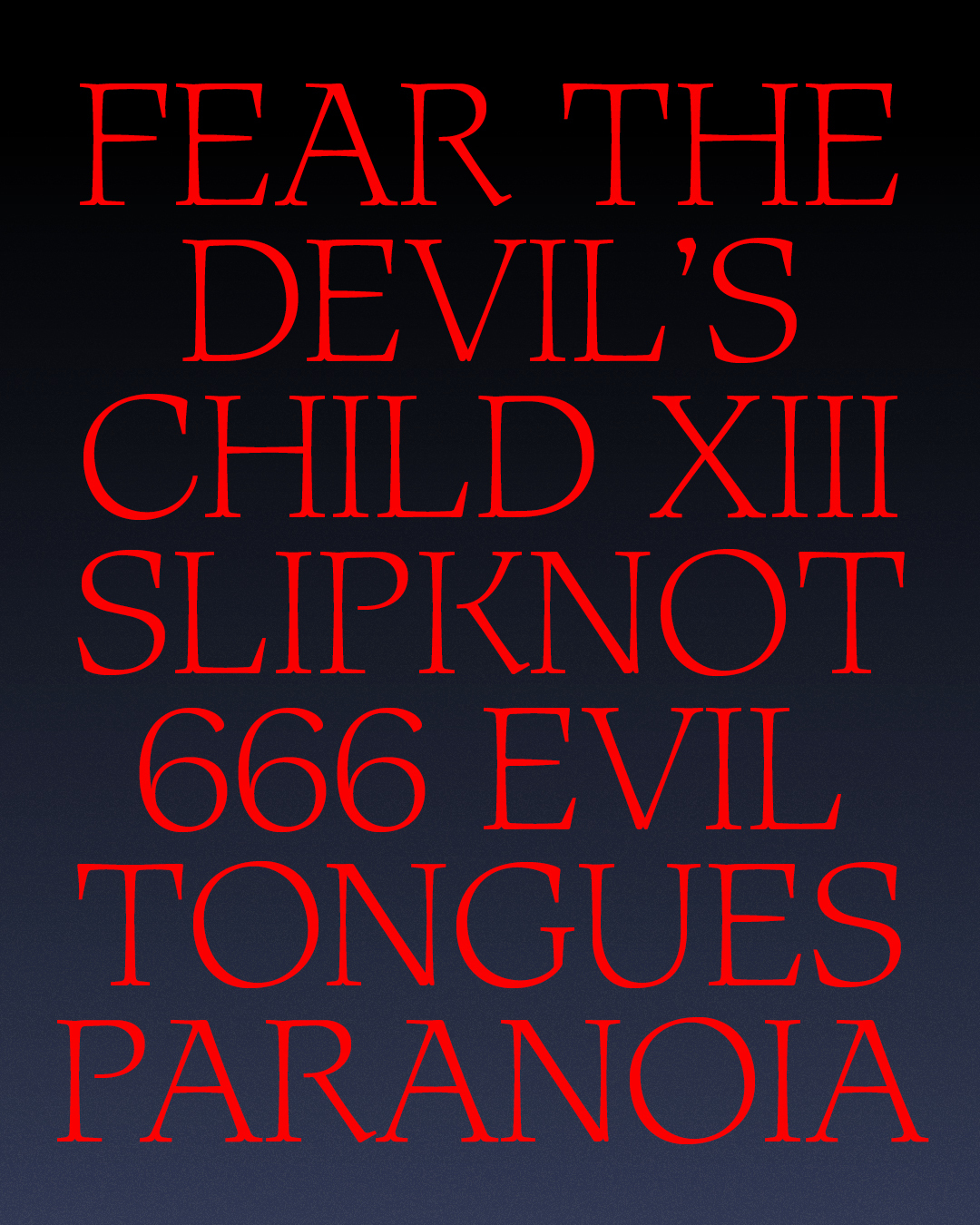
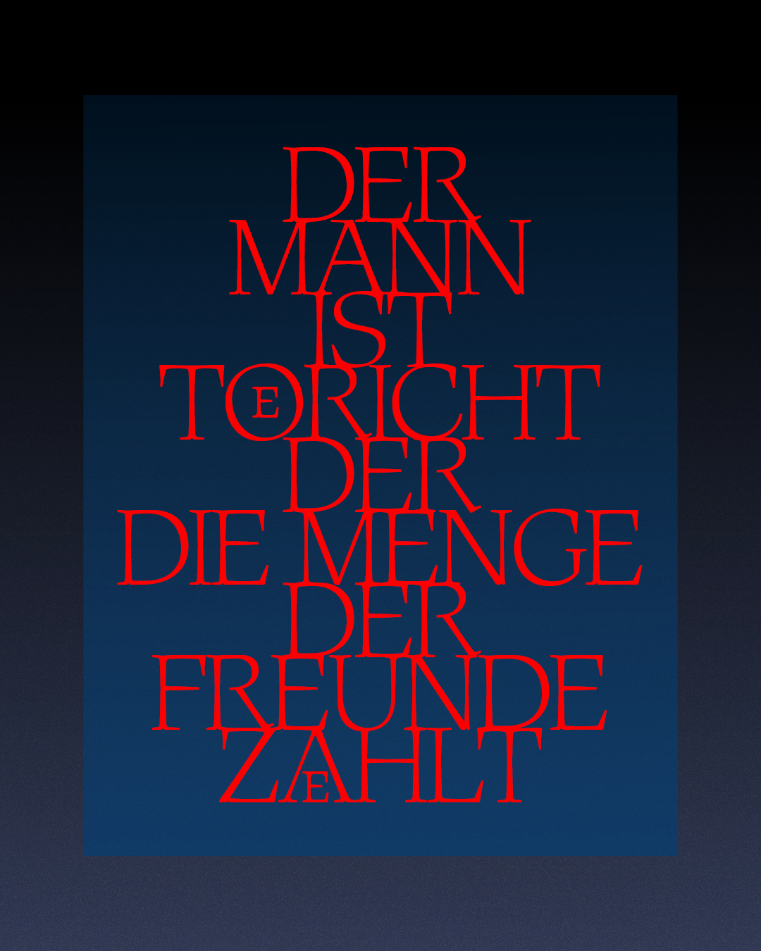
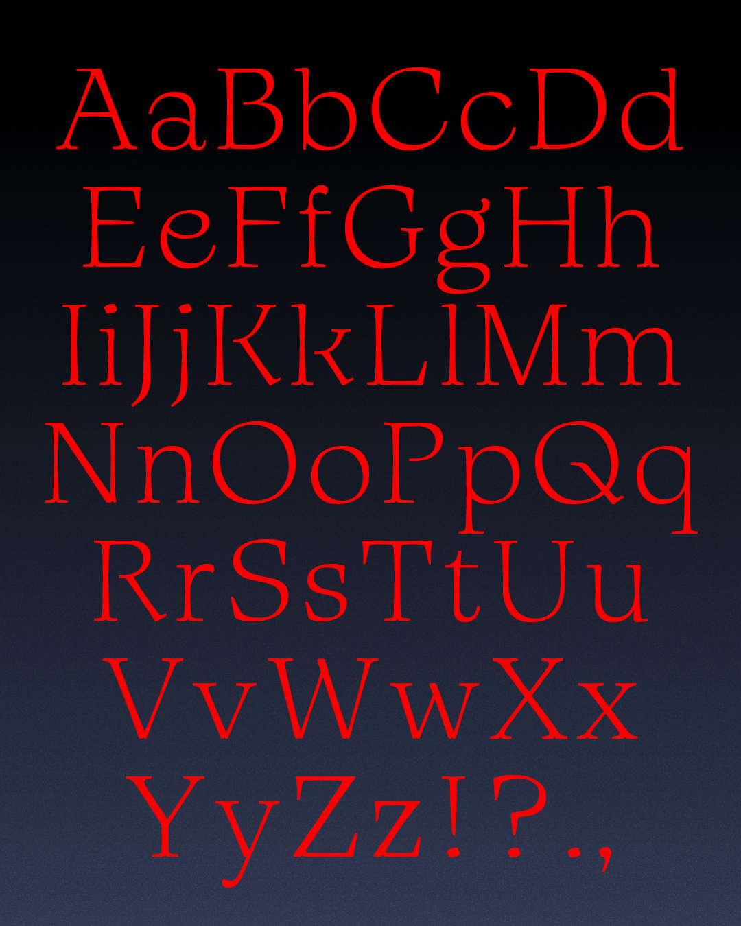
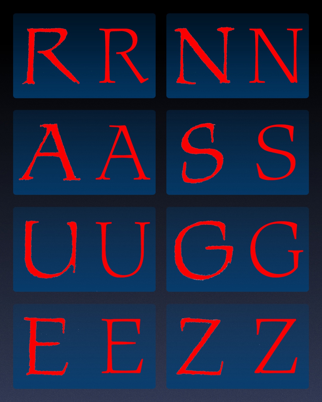
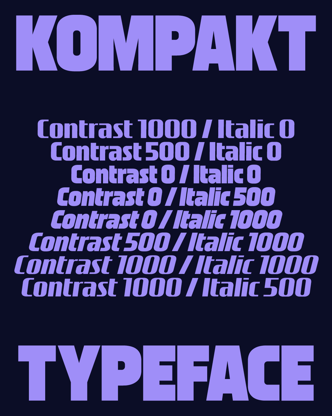
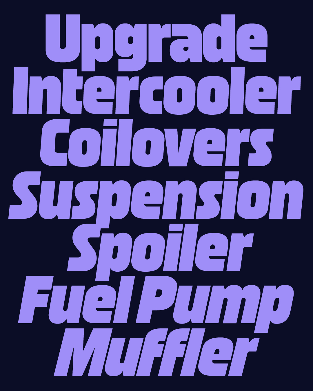
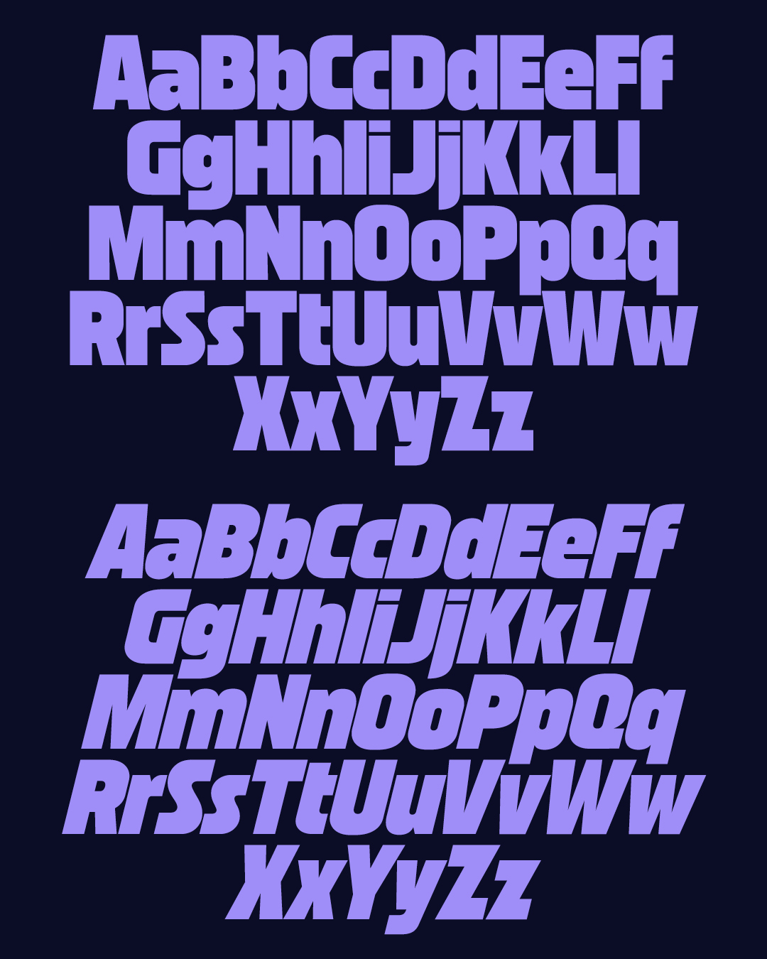
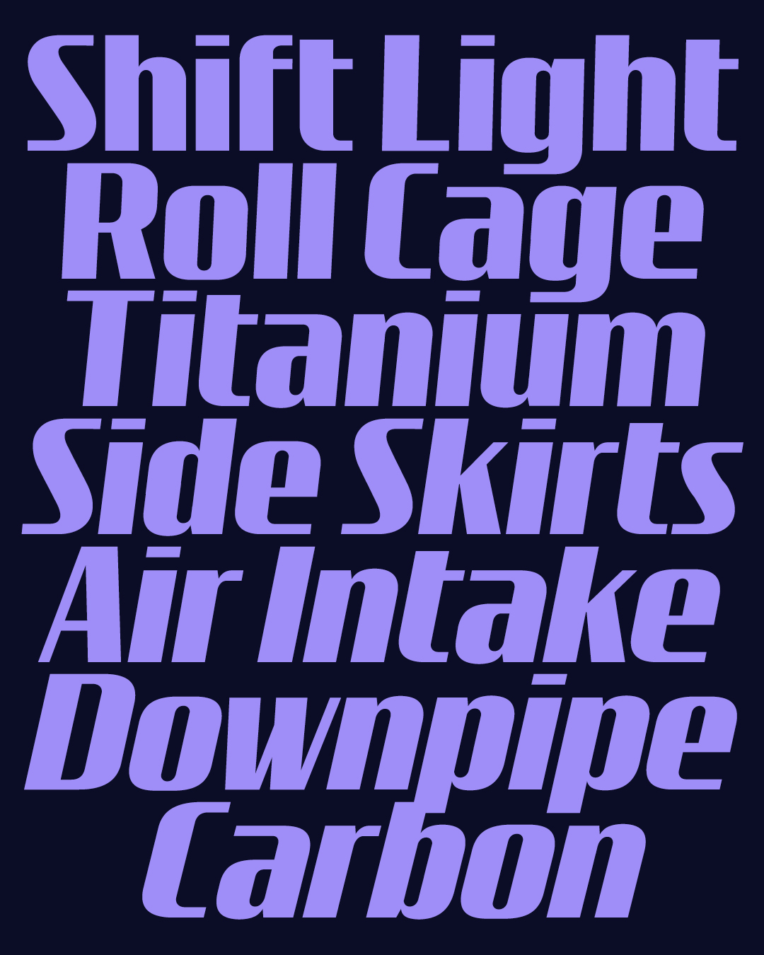
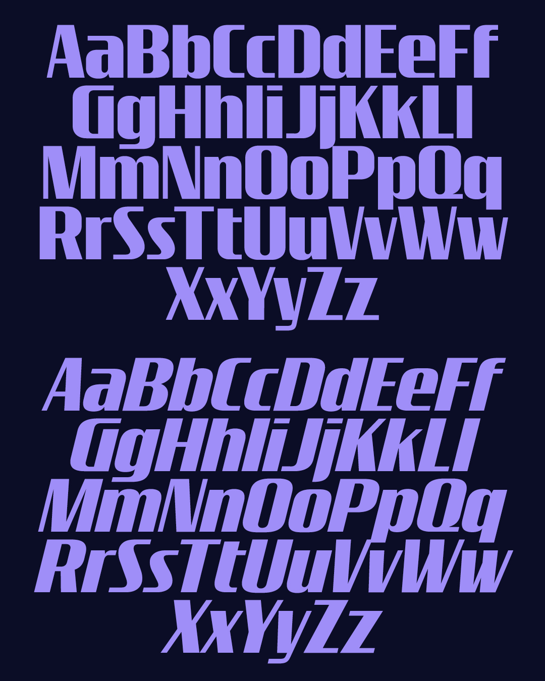
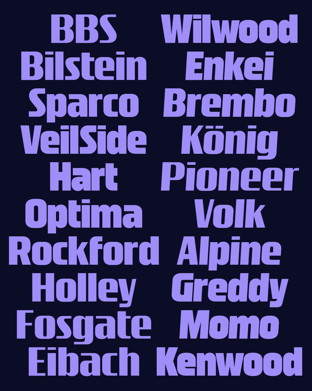
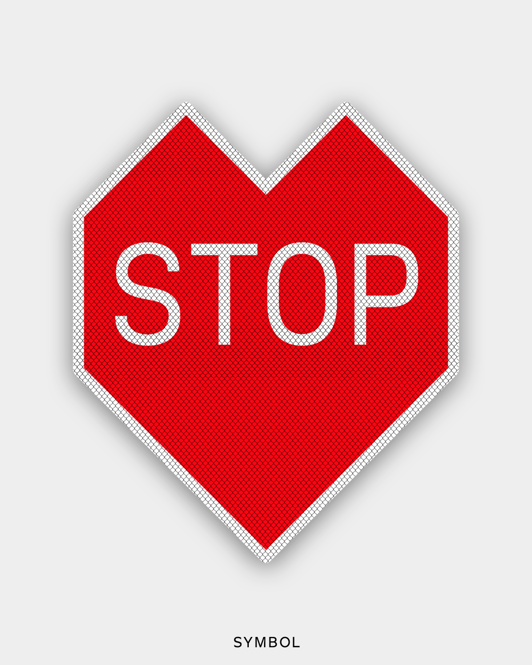
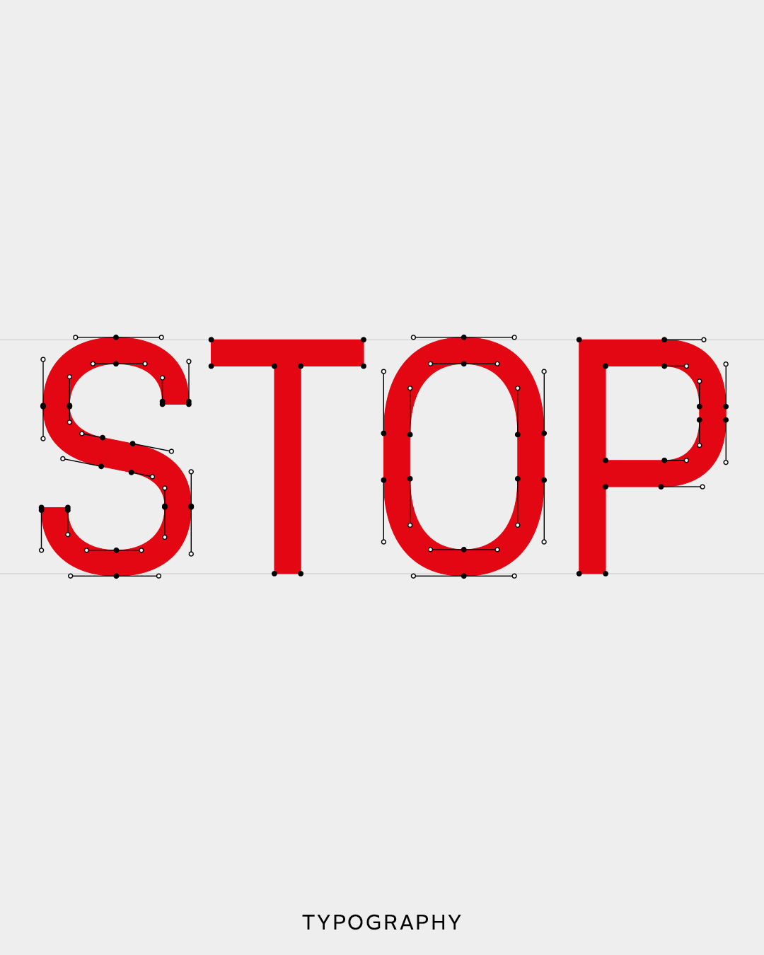
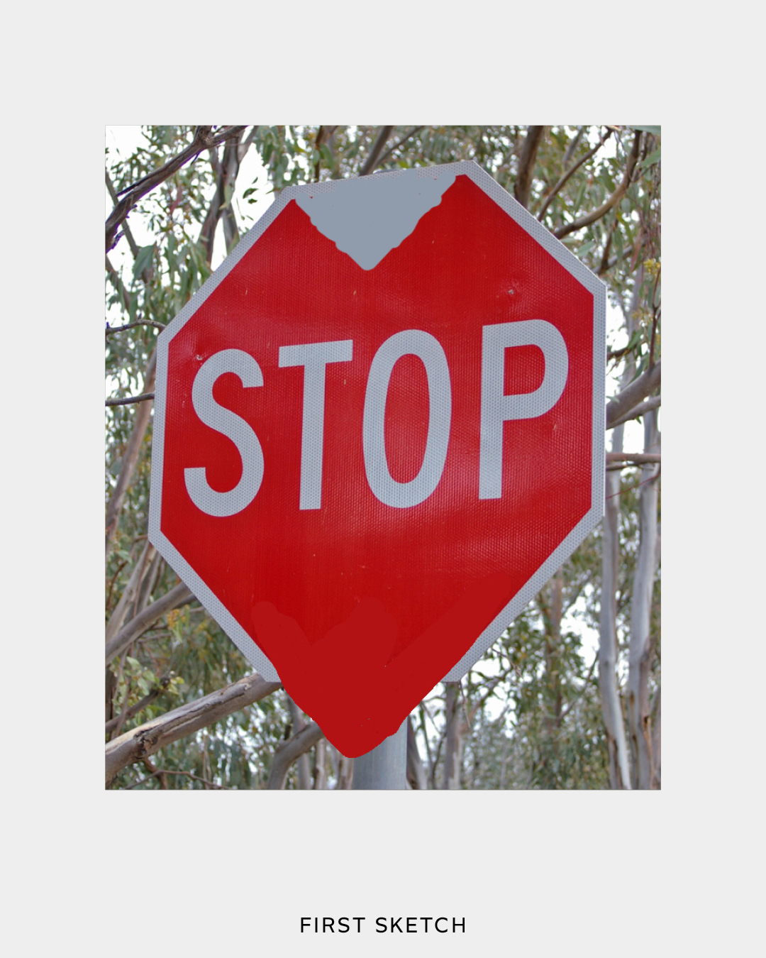
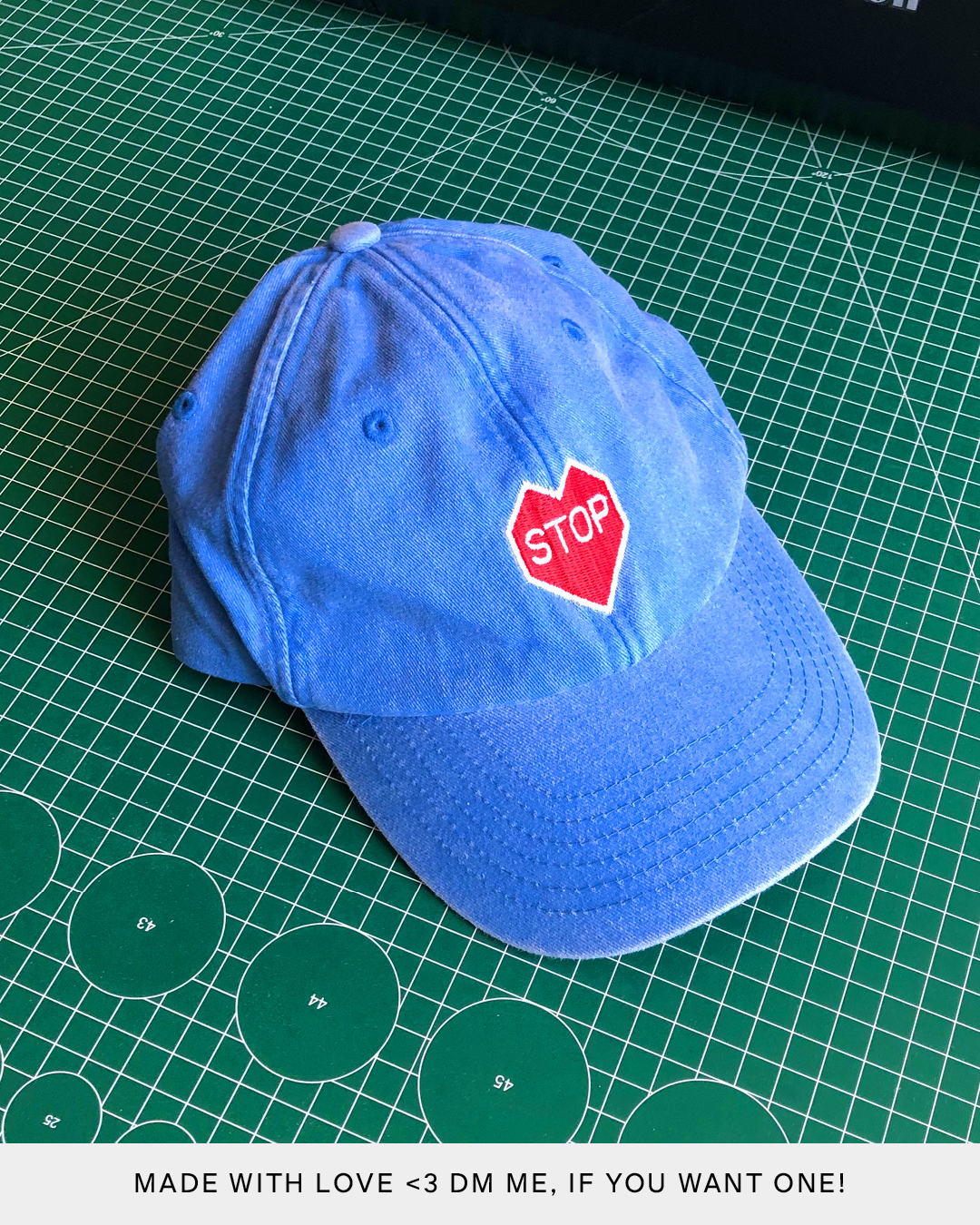
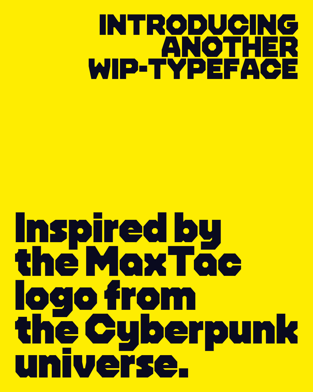
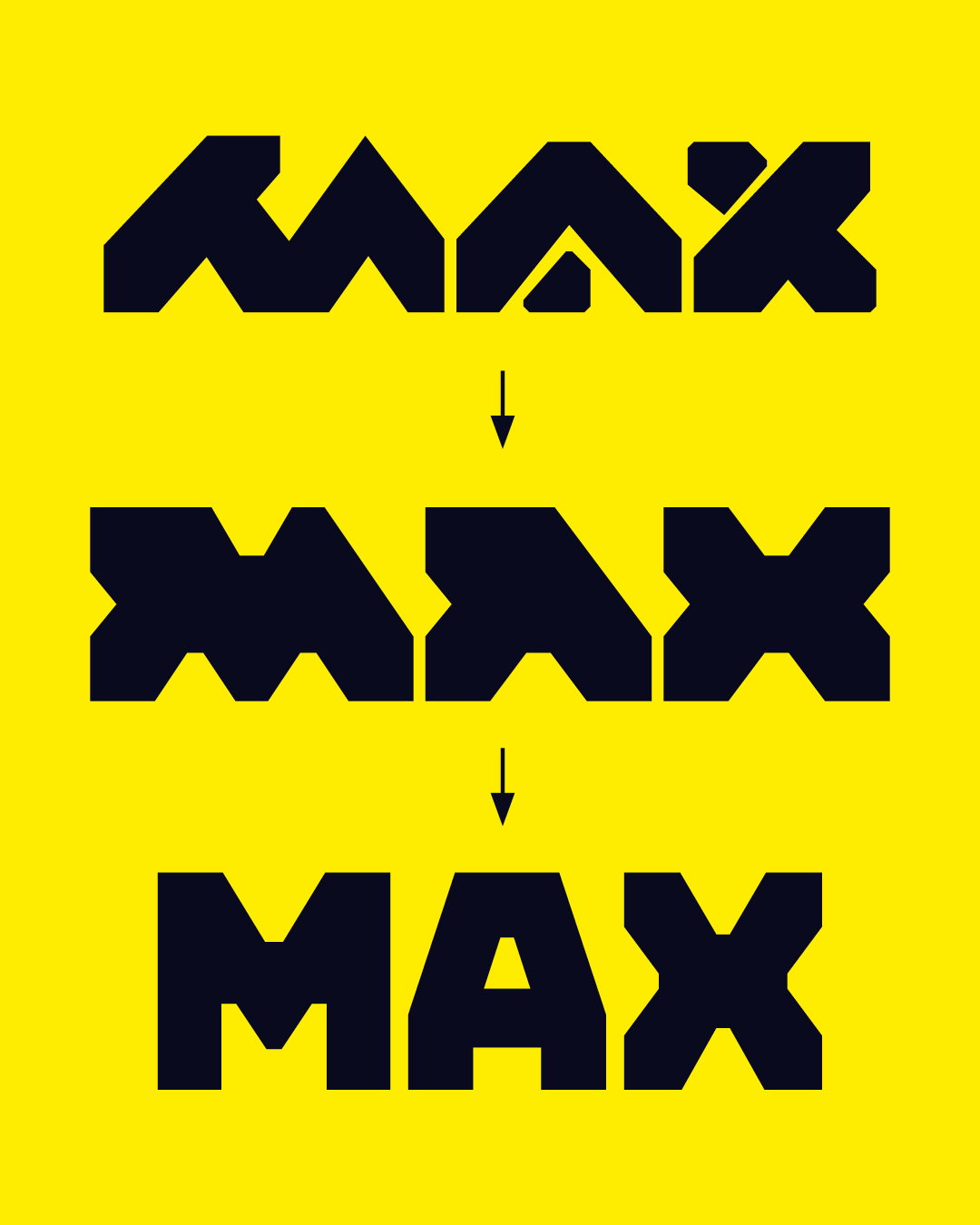
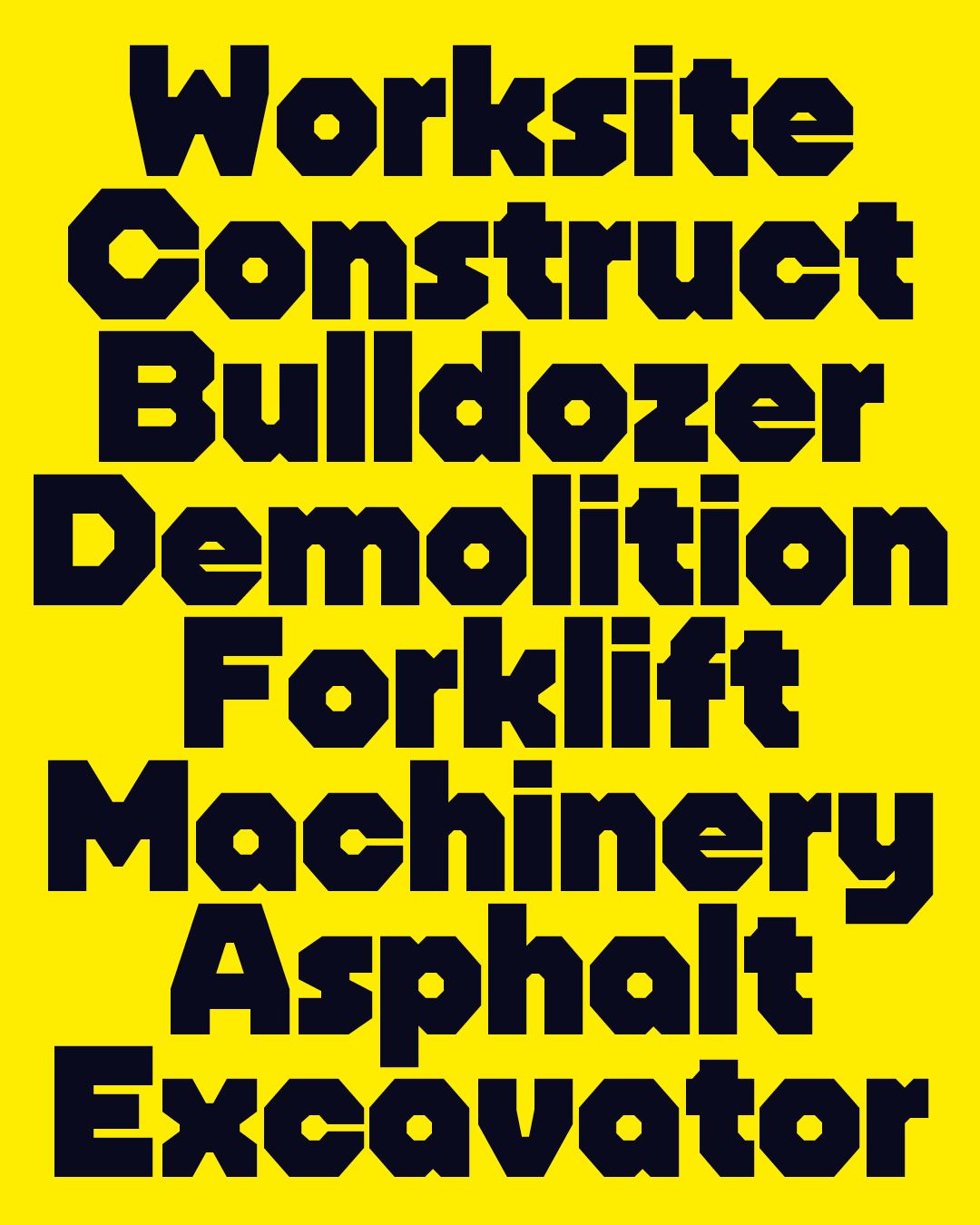
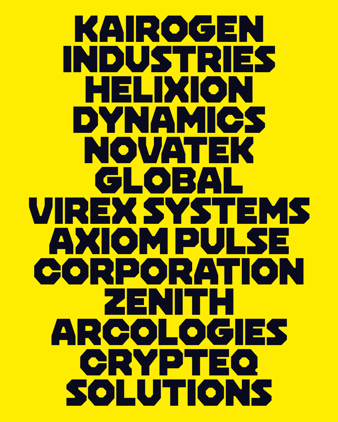
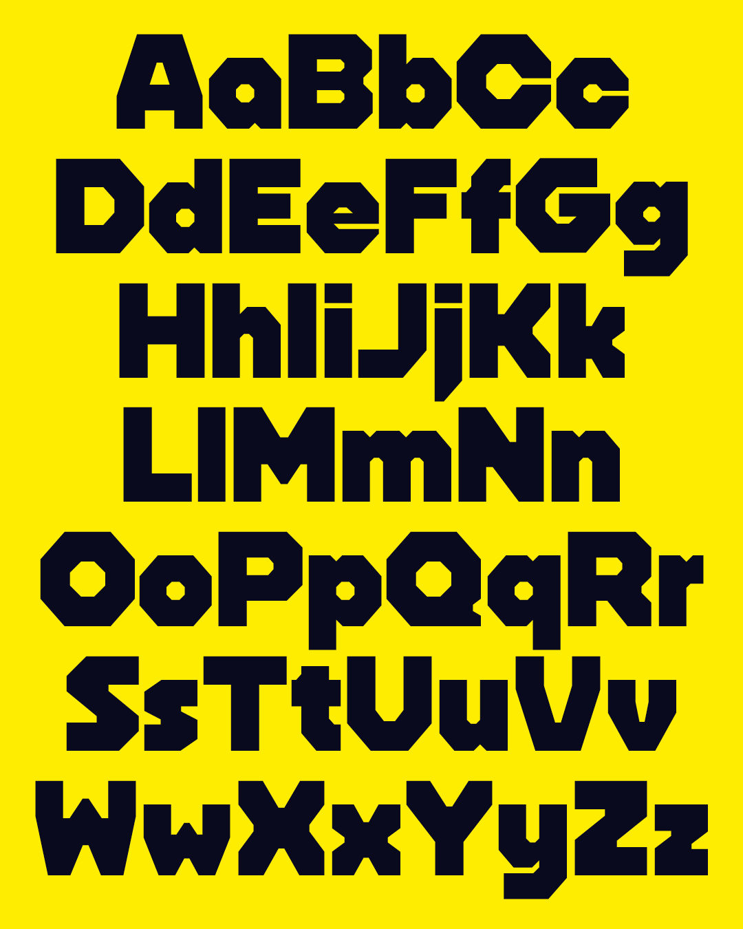
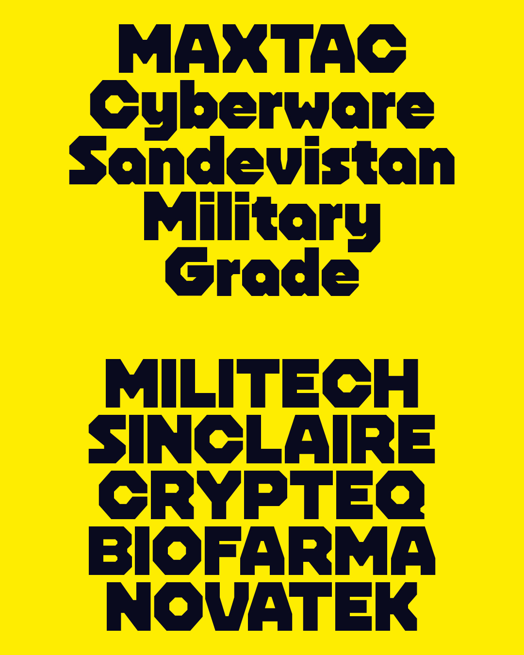
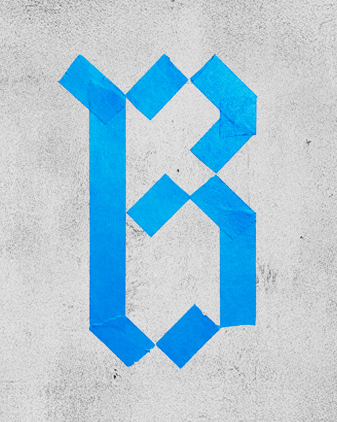
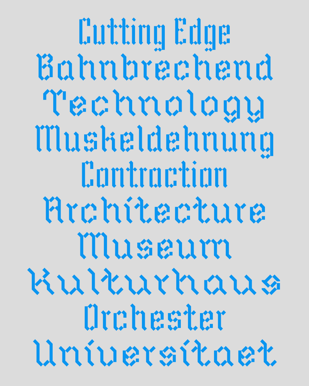
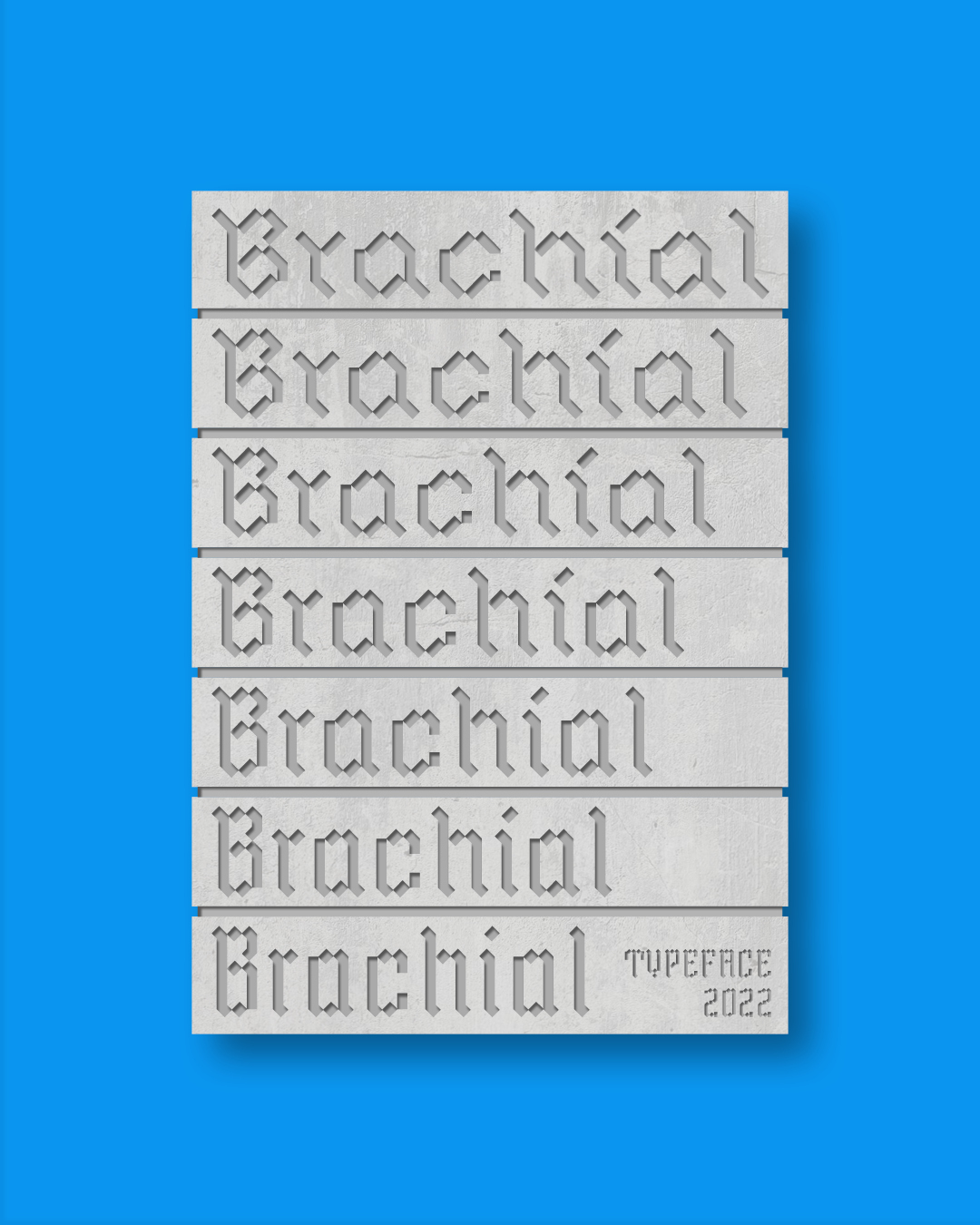
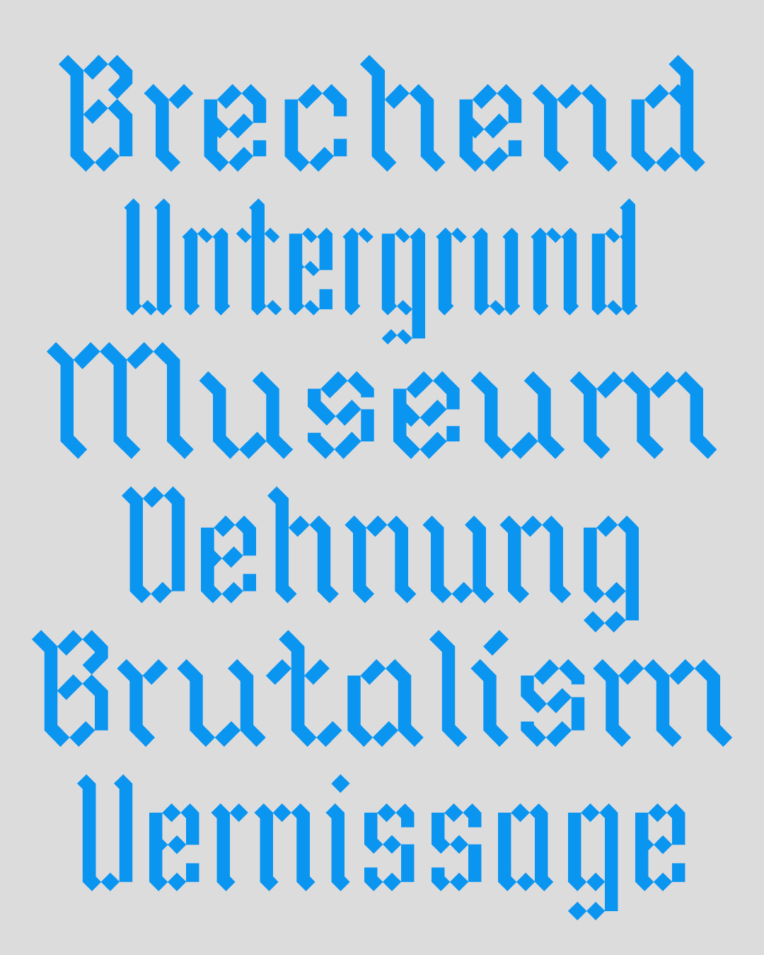
Vienna-based graphic, information, and type designer, specializing in branding for the art, culture, and culinary industries. I create visual identities and design systems that elevate my clients in competitive markets. With a strong focus on typography and a concept-driven approach, I deliver functional solutions built to last.

Work

Branding

Editorial

Typefaces

A Modern Identity Rooted in Tradition

Engadiner is a family-owned vacation farm and winery in South Tyrol, Italy, with a long agricultural heritage. Its new identity brings this tradition into a contemporary context, reflecting the history of the location and the evolving craft of the winery. Drawing inspiration from the Fraktur typeface of the original “Engadiner Hof” logo, a contemporary version of the letter E was created. A custom sans-serif typeface complements the logo, striking a balance between the past and the present. The letter E was also explored in three dimensions, evoking the appearance of a carved stone letter. This detail adds character to the logo and echoes the winery’s craftsmanship and care.

Client
Development of
Brand Strategy, Brand Design, Brand Identity, Custom Typography, Labels, Social Media Posts, Product Packaging, Photography.
Model
Anja Stradner
1/8
INFO

Aeterna Typeface

Aeterna is an extension of my work on Ärger, which is based on the rhythm of Capitalis Monumentalis. While Ärger draws on pen-based letterforms, this design is more closely informed by the chiseled visual language of Roman monumental inscriptions interpreted in a simplified manner. Its reduced forms and slightly restrained serifs give it a contemporary character, creating a dialogue between historical elegance and modern typographic design.

CURRENT STATE
PLANNED UPDATES
Basic Latin glyph set
ASCII (+ punctuations)
no variable axis
1 variable axis
1 weight
Multiple weights
Display style
Display and text style
1/7
INFO

A Sign of Care

A few years ago, I came up with the idea to reshape a stop sign into a heart. To me, this symbolizes giving something up out of love. It’s about choosing to stop certain habits or behaviors for the sake of others, whether they are people, animals, or nature. For example, it could mean giving up meat out of love for animals or considering the climate and the well-being of our planet more broadly. In that sense, the symbol represents small acts of restraint motivated by care for all living beings :)

Development of
Logo, Custom Typography, Photography
Model
Anja Stradner
Embroidery
1/7
INFO

Interpol Typeface

Interpol is a variable font with a grid-based system. The design plays with different levels of inner and outer edge rounding, shaping letterforms that move between sharp corners and gentle curves. This variability makes the design process visible by showing how a clear idea evolves from something abstract. This contrast gives Interpol a dynamic visual character, making it ideal for striking headlines, futuristic designs, and expressive typographic compositions.

FORMAT
PRICES
Static cut
20 €
Variable
90 €

CURRENT STATE
PLANNED UPDATES
ASCII (+ punctuations)
Latin Extended-A
Multiple stylistic sets
/
2 variable axis
3 variable axis
1 width
Multiple widths
1 weight
Multiple weights
1/6
INFO

Between Structure and Fluidity

Strange Days is Jakob’s diploma exhibition, exploring themes of creation, preservation, and the fleeting nature of memories. At the heart of the exhibition are three sculptures that juxtapose rigid metal frameworks with organic objects, creating a tension between structure and fluidity. The exhibition’s posters and information sheet draw directly from this contrast. The layout keeps the grid visible to echo the strict metal structures, and the typography introduces a softer, more organic movement to reflect the dialogue between stability and transience present in the sculptures.

Client
Development of
Logo, Custom Typography, Editorial Design, Print Design
Photography
1/6
INFO

Kraken Typeface

Kraken is a playful display typeface that blends Wild West flair with Italian elegance. I started exploring it in 2021, inspired by the letter “F” I saw in a mural in my hometown. Using a calligraphy pen, I created initial sketches, reinterpreting the distinctive features of the letter. Through continuous experimentation with pen angles and stroke contrasts, the design evolved into an Italian-style typeface, establishing the foundation for Kraken’s visual identity.

FORMAT
PRICES
Static cut
20 €
Variable
90 €

CURRENT STATE
PLANNED UPDATES
ASCII (+ punctuations)
Latin Extended-A
Multiple stylistic sets
/
1 variable axis
2 variable axis
1 width
Multiple widths
1 weight
Multiple weights
1/6
INFO

Making Sense of Complexity

Der Störenfried (“The Troublemaker”) was developed to address today’s information overload. While information is everywhere, many people lack the time or tools to fully understand, filter, and connect it. The newspaper presents complex topics in a clear, structured way, with chronologically arranged articles and a reference system that highlights connections between content. A custom design language, infographics, and typography make comprehension quick and intuitive. The first issue focuses on the “War on Terror,” exploring conflicts, victims, costs, war crimes, and their consequences. Its engaging design and thoughtful structure sparked interest—even among readers who might not usually engage with such topics.

Student Project
Development of
Storytelling, Logo, Custom Typography, Icons, Infographics, Editorial Design, Print Design, Photography
Professor
1/7
INFO

Ärger Typeface

Ärger is a serif typeface that blends elegance with a hint of ominousness. It was inspired by hand-drawn letterforms found in a very old book I discovered in my parents’ attic. The project began in 2021, starting with the redrawing of the capital letters from the book, followed by their digitization. Some of the characters had subtle indentations on their base serifs where the strokes hadn’t connected properly. I found these small imperfections quite charming and decided to incorporate them into every glyph. Building on those initial forms, I refined the overall rhythm and structure of the typeface.

FORMAT
PRICES
Static cut
20 €

CURRENT STATE
PLANNED UPDATES
ASCII (+ punctuations)
Latin Extended-A
no variable axis
1 variable axis
1 weight
Multiple weights
1/7
INFO

Moments in Focus

The Leica photo auction catalog features exceptional photographs, each with its own story and significance. The goal of this project was to create a layout that highlights the images while keeping the accompanying text informative yet unobtrusive. A flexible grid system enables the dynamic arrangement of images and text, adapting to the shape and format of each photograph. The text is minimal and restrained, avoiding decorative styles to maintain a clean, uncluttered aesthetic. Drawing inspiration from the understated elegance of sympathy cards, the design brings a sense of quiet reverence to the photographs, emphasizing their importance and creating a contemplative experience for viewers.

Development of
Editorial Design, Print Design
1/6
INFO

Walze Typeface

Walze is a sans serif typeface with four style sets, all based on a shared structure blending grotesque and gothic elements. Each style features unique glyph terminals: Set 1 emphasizes a Gothic character, Set 2 draws inspiration from Bauhaus, Set 3 adopts a distinct Humanist approach, and Set 4 features a more Grotesque aesthetic. The consistent structure allows for seamless mixing and matching of styles.

Student Project
Professor

FORMAT
PRICE
Static cut
30 €
Variable
120 €
CURRENT STATE
PLANNED UPDATES
Latin Extended-A
Additional languages and symbols
1 variable axis
2 variable axis
1 weight
Multiple weights
1/9
INFO

Designing Precision

Ski Time Test is a small, family-owned company that specializes in compact timers for ski racing. The redesign modernizes the brand identity, reflecting the company’s reputation as a self-sufficient, engineering-driven team. A custom typeface and corporate design system were developed to embody the fusion of traditional craftsmanship and forward-thinking innovation. The logo draws inspiration from a clock face and a snowflake to symbolize the core elements of ski racing. This cohesive design establishes a compelling visual identity that honors the company’s legacy while positioning it for future growth.

Client
Development of
Brand Strategy, Brand Design, Brand Identity, Custom Typography, Labels, Social Media Posts, Product Packaging, Editorial Design, Print Design, Photography.
1/5
INFO

Kompakt Typeface

The Kompakt typeface conveys speed, boldness, and modernism, all while maintaining compactness and versatility. It maximizes space efficiency without sacrificing style or legibility. Through its variable contrasts, Kompakt delivers clear readability at all sizes and reliably performs in diverse applications.

FORMAT
PRICE
Static cut
30 €
Variable
120 €
CURRENT STATE
PLANNED UPDATES
Latin Extended-A
Additional languages and symbols
1 variable axis
2 variable axis
1 width
Multiple widths
1 weight
Multiple weights
1/6
INFO

Spaces of Exchange

Reposition Magazine provides a platform for presenting research and sharing insights on work in progress, fostering constructive criticism. The publication encourages dialogue and interaction, creating an open space for collaboration and the exchange of ideas. The concept of “in-between” — the connections and interactions between people, ideas, and processes — inspired the magazine’s design language. This concept is reflected in the treatment of space throughout the publication. The space between columns is intentionally disrupted to create unconventional layouts that invite exploration. Design elements occupy unexpected positions, breaking traditional boundaries and encouraging readers to engage with content from fresh perspectives.

Development of
Custom Typography, Editorial Design, Print Design
In cooperation with
1/7
INFO

Brachial Typeface

Brachial is a modular display typeface inspired by traditional Fraktur letterforms. Constructed from vertical and diagonal strokes, its structure is raw and geometric. Designed as a variable font with a single axis, it transforms from ultra-narrow to ultra-wide by extending its diagonals and compressing its verticals, or vice versa.

CURRENT STATE
PLANNED UPDATES
Basic Latin glyph set
ASCII (+ punctuations)
Multiple widths
/
1 variable axis
2 variable axis
1 weight
Multiple weights
1/6
INFO

Blocks of Information

The ORF Public Value Report 2022 showcases the broadcaster’s internal data, emphasizing its contributions to diversity and society through reporting and broadcasts. The redesign aimed to create a visually engaging format while maintaining a professional and trustworthy tone. The layout emphasizes clarity and restraint, reflecting the precision of the presented numbers. The cover’s brick design symbolizes data as solid, reliable entities and echoes the rectangular shape of the ORF logo, affectionately known as “ORF-Brick.” This motif extends to the interior pages, where it appears in infographics and visual elements, creating a cohesive visual language. This approach establishes a publication that clearly communicates complex information while reinforcing the reliability and significance of ORF’s work.

Development of
Editorial Design, Print Design, Infographics
1/7
INFO

Shaped by Identity

As part of the new FWF identity, a set of icons was developed to complement and align with the updated visual language. The design process centered around integrating the distinctive angle and stylistic features of the new logo into the icon set. The angle of the logo influenced not only the overall forms but also the way lines intersect, how corners are shaped, and how line endings are executed. This consistent approach creates a cohesive visual system that ties the icons seamlessly to the broader identity. The resulting icon set balances clarity and sophistication, offering a visually unified and easily recognizable representation of the FWF brand across various applications.

Client
Development of
Icons
1/3
INFO

Celebrating Knowledge

The 2023 ÖAW Annual Report presents the institution’s yearly activities and achievements. The redesign balances flexibility with a cohesive visual identity, enabling the integration of diverse information while maintaining a professional and polished appearance. Drawing from the original ÖAW visual language, the design preserves key elements such as the blue color palette, typefaces, and the distinctive logo style. Consistent lines appear at the top of pages to introduce text and at the bottom to mark conclusions, creating a structured, recognizable visual rhythm throughout the publication. This cohesive approach results in a report that clearly communicates complex information while reinforcing the ÖAW’s professional identity.

Client
Development of
Editorial Design, Print Design, Infographics
1/5
INFO

Play & Explore

As a graphic designer, it’s essential to experiment on both client projects and personal work to develop your skills. Without it, it’s easy to fall into simply imitating others’ work. These experiments often lead to ideas that may never fully materialize, but they’re fun to explore and frequently spark something new. Since experimental projects are a key part of my practice, here’s a quick look at a few of them.

Development of
Branding, Typography, Imagery,
Disclaimer
These are all fictional projects.
1/11
INFO

Service

Branding Service

The Branding Service develops original ideas from scratch or refines existing concepts for new contexts. It focuses on creating clear, cohesive visual identities that work consistently across applications and media. It covers a broad range of projects, including complete brand identities and individual design solutions such as logos, typographic hierarchies, color schemes, websites, infographics, icons, merchandise, wayfinding systems, and animations.

INFO

Editorial Service

The Editorial Service develops visual systems for publications from scratch or refines existing layouts for new formats, ensuring a clear and engaging presentation. The service covers projects such as print and digital publications, editorial layouts, infographics, image systems, and content-driven designs for books, magazines, reports, and online platforms.

INFO

Typography Service

The Typographic Service develops and refines typographic systems, typefaces, and custom lettering to ensure clarity, consistency, and expressiveness. The service covers a range of applications, including corporate and editorial typography, logo lettering, signage, and other design projects in which type plays a central role.

INFO
Franz Tiefenthaler